Color Psychology for Home Staging
/Wanted to share this great article with you by Kellie Tollifson from T-Square Properties. Visit their blog if you want more tips and advice.
Color Psychology for Home Staging
Color affects the subconscious level. It can affect your emotions, mood, and gives you a remarkable feeling. And, this is why interior designers, and artists in general, are keen as to what color they use when working on a project.
So, are you thinking of staging your home? If so, it’s important to understand the psychology of colors so as not to make a potentially costly mistake. Remember, Kellie of T-Square Real Estate Services warns, how successfully your home is staged can have an impact on how quickly or slowly your home sells.
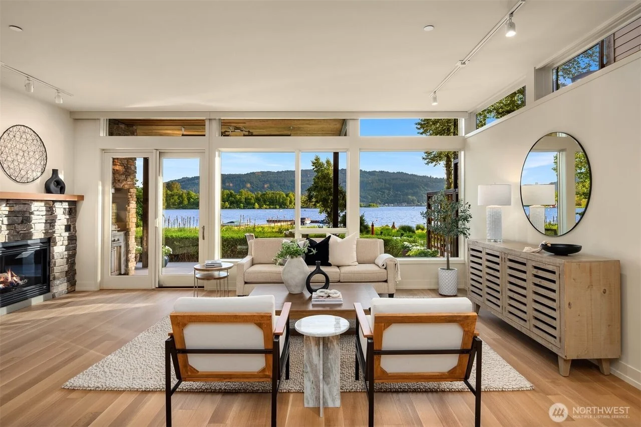
The colors you choose should highlight your home’s comfort, security, and efficiency. Below is some crucial information about some of the most common colors and how you can use them to stage your home successfully.
White
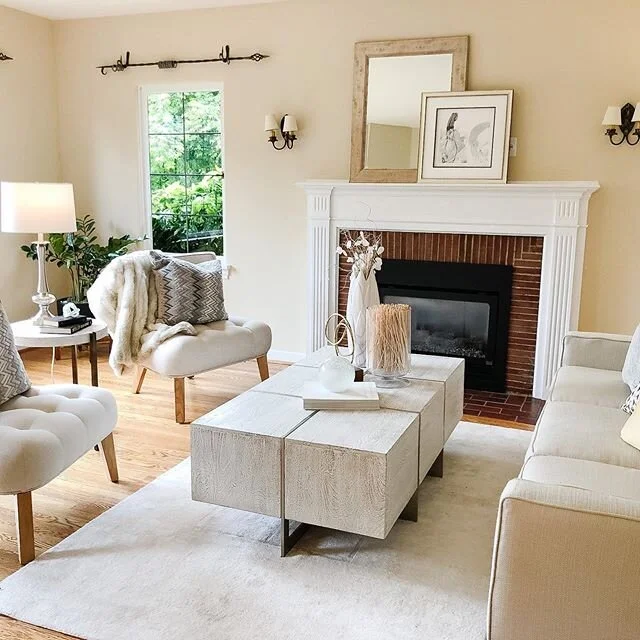
What comes to mind when you think of the white color? Cleanliness, right? In the psychology of colors, besides cleanliness, white color also symbolizes hygiene. It also gives the perception of space, particularly for small spaces.
As such, if you are working with a small space, white is the color to use. That said, using too much of it, especially in large rooms, can scream “Don’t touch me!” and can be quite clinical.
Red
Red is associated with blood and fire. Consequently, it is usually associated with energy, war, danger, strength, power, and passion.
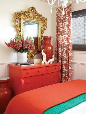
When used properly, it can make one more accurate and much more attentive to detail. So, how can you use it to attract the attention of a would-be buyer? Well, you could use a red accessory on the fireplace mantel or place a vase of red flowers on a sparkling granite counter top surface.
Blue
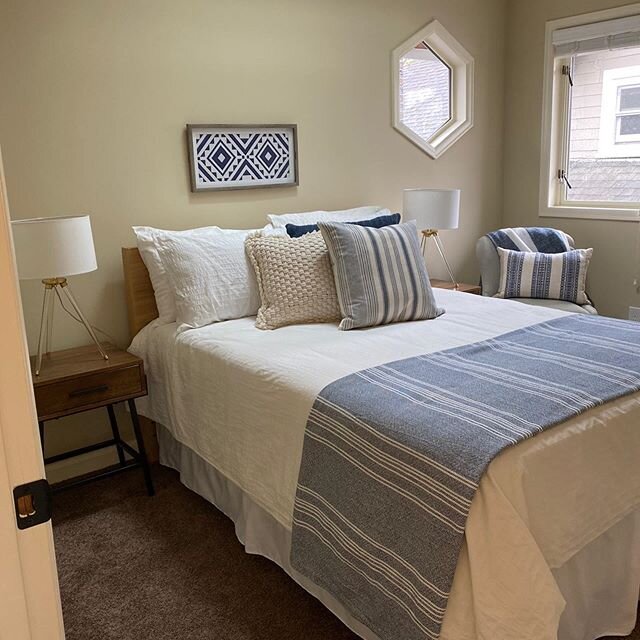
Photo by Clarity NW
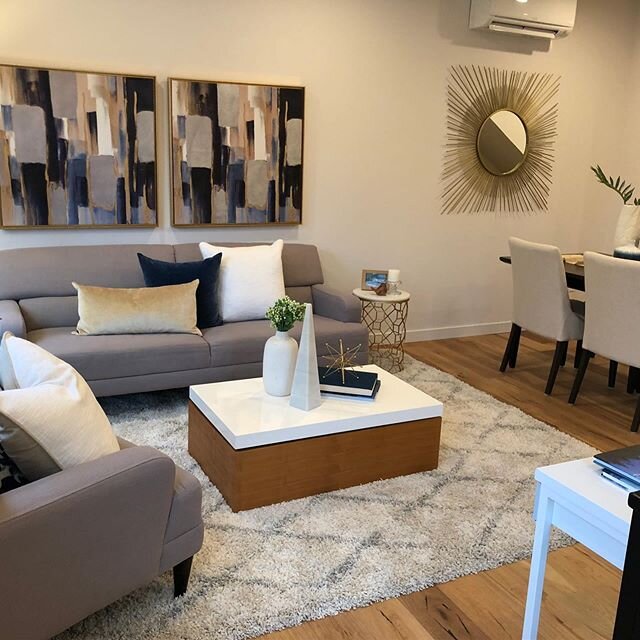
Blue is the color of trust and responsibility. It calls to mind feelings of serenity and calmness. Blue symbolizes wisdom, confidence, intelligence, faith, and truth. It tends to be favored by so many people and is often viewed as a non-threatening color that is traditional and conservative.
Just like other colors, the last thing you want is to overdo it. Overdoing it will make it come off as cold or unfriendly.
Blue works like a charm when used either in the bathroom or bedroom. You may even consider painting the kid’s room soft blue. Research has found that the blue color can help invigorate the creativity of people.
Yellow
Yellow is a bright color that immediately grabs the eye. It creates a sense of energy and excitement. When used properly, it can help evoke strong feelings of happiness and optimism.
But remember, overdoing it will only work against you. In fact, excessive use of yellow color can be overwhelming and can even cause some people to feel suicidal, fragile, or even depressed.
Just like the other colors aforementioned, go with shades of yellow. This is especially true in hidden areas like the basement.
Green
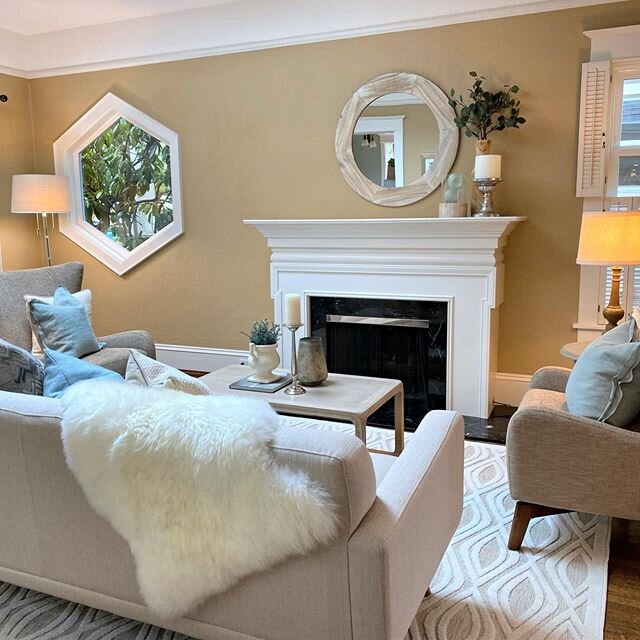
Photo by Clarity NW
Green is the color of life. It is associated with the environment, growth, harmony, freshness, safety, and fertility. Traditionally, green is also associated with money, finances, greed, and ambition.
Research focused on treatments for seasonal affective disorder found the green color to improve mood.
When it comes to home staging, using it on bedroom walls usually does some wonders. More particularly, shades of neutral greens can help give a sense of harmony and rest.
Purple
Purple combines the calm stability of blue and the fierce energy of red. It’s usually associated with ambition, nobility, royalty, and power.
You can use the richness of purple to elevate a room, which should help you seize the attention of a buyer.
Lighter shades of orchid, lavender, or lilac can help evoke a feeling of heightened creativity, maturity, and calm. The most intense shades of eggplant or violet, on the other hand, can indicate a luxurious feeling.
Paint Color Mistakes to Avoid
Avoid choosing flamboyant colors. Steer clear of neon colors like orange. Using these can make your home look gaudy and can turn off potential buyers.
Avoid using trendy paint colors. Use a versatile color that will be functional for every season.
Avoid using the wrong paint finishes. Paint finishes come in different varieties, from high gloss to matte. If you are unsure about a particular finish, test in a small area and see how it looks before applying it to your walls.
Avoid overpowering the rooms décor. Pick a color that doesn’t contrast with the décor. In other words, pick one that is in harmony with the furnishings you have.
Avoid extremely dark colors. Avoid colors like grays, browns, and blacks. These will absorb natural light and leave a room feeling like a cave.
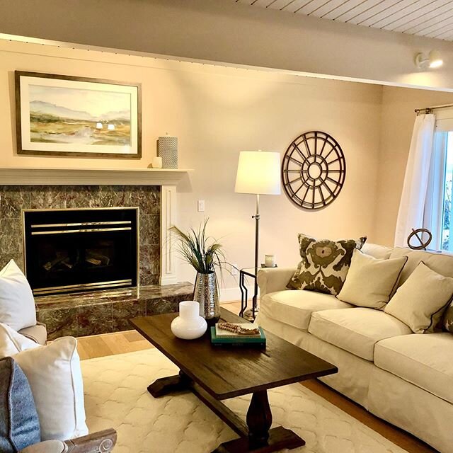
Avoid impractical colors. While white can make a room glow, it can be difficult to maintain, especially if the buyers have small kids. Cream can be a good alternative here.
There you have it. How you can make use of different colors to sell your home fast. Aside from using the right color, you also want to make sure you hire the right person for the job.
Kellie Tollifson
More about Kellie:
What do you love most about your profession?
As a small business owner, a property manager and a speaker, I like helping and sharing my knowledge with other small business owners.
How long have you been in the business?
I’m actually a property manager and have been in the business for 20 years!
What room in your house would you put a lava lamp?
Bedroom!
What do you do to get rid of stress?
I like exploring the Northwest and working out!
What do you think about when you are alone in your car?
My job! Work relationships are something I’m continually trying to improve and bring to the optimal level of efficiency, profitability and fun.
Thank you Kellie!

