
Staging-Laurelhurst
/
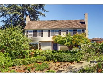
I don't have to love all of the houses we stage. This one tops my "do not want even if you gave it to me list". Sister Ex did not feel the same. She very much liked the house-but I just ignored her as sisters do.
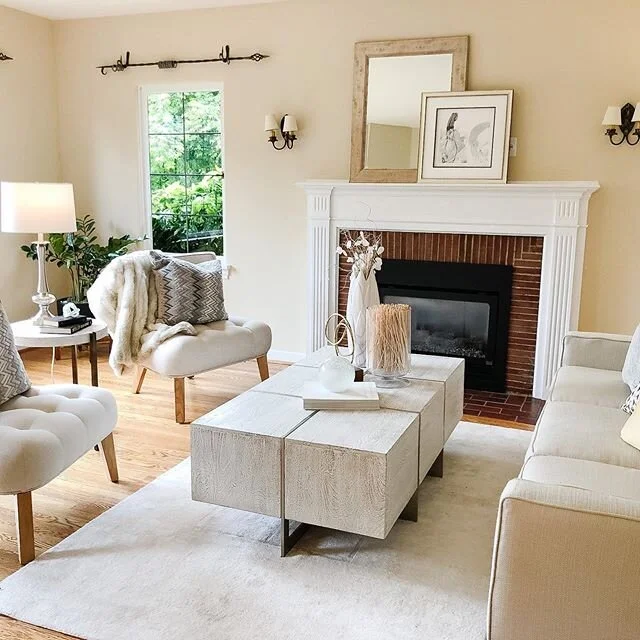
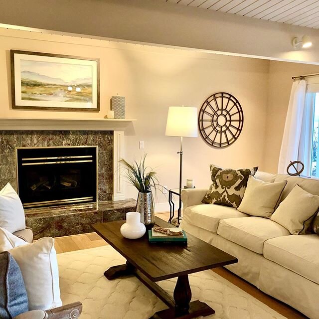
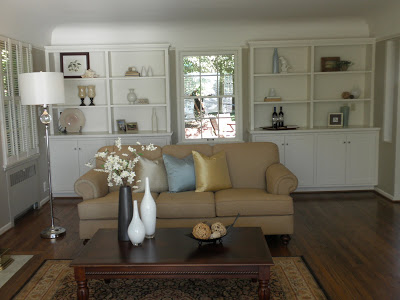
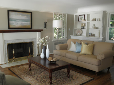 We lightened the boring living room by going with just cream, blue, green & white. I do like the results.

 The window behind the couch really should be a door leading to the garden but it was just a window... a big tease. Not that the back yard was anything. Just a bunch of mismatched Home Depot pots but in my imagination it was fabulous and a door to fabulous would have been good.
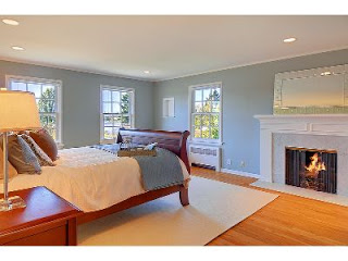
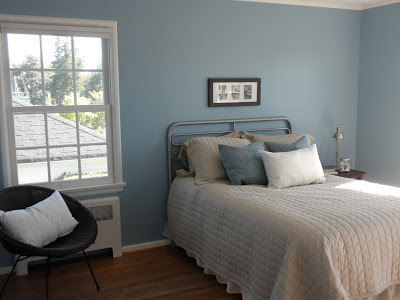
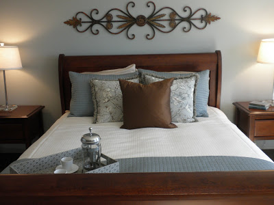 This is where the remodel money was spent. The master was lovely.
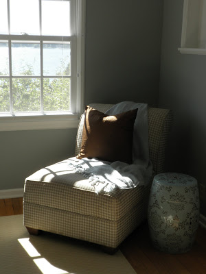
A nice view, pretty dressing area, beautiful bath and a fireplace that almost beat out the view.

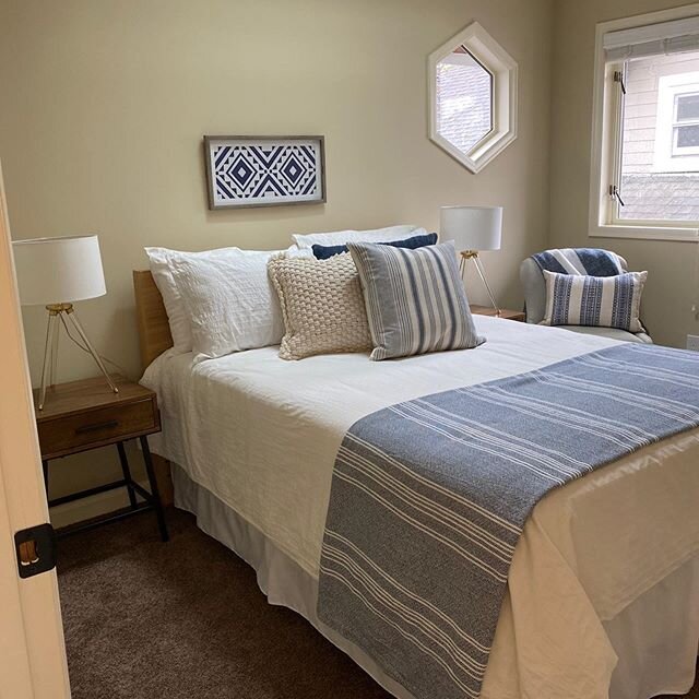
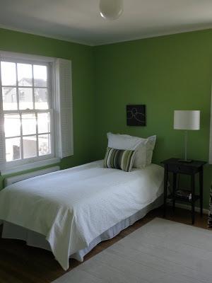
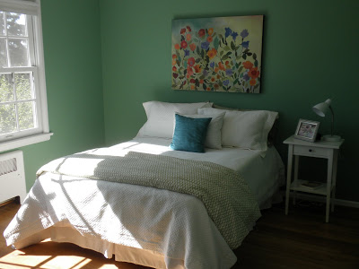 In case Bed Bath & Beyond is wondering where their white bedding went you can point them in this direction. The kid's bedroom colours were screaming loud so we had no choice but to tone them down down down.
A nice view, pretty dressing area, beautiful bath and a fireplace that almost beat out the view.
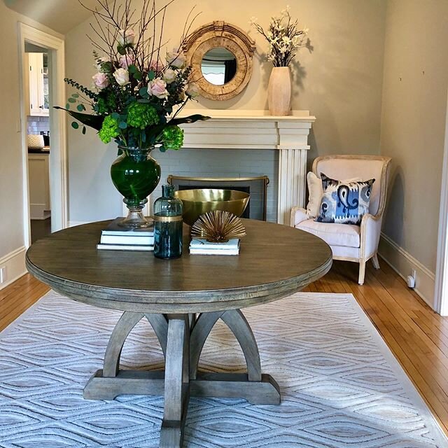
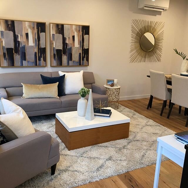
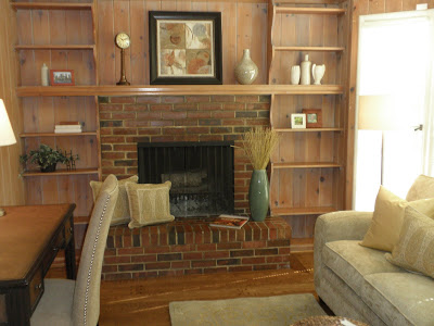
This room could have used the remodel dollars. It was right off the entry so it was a visual from the moment you entered. Our goal was to lighten it up as much as possible.
Yikes!
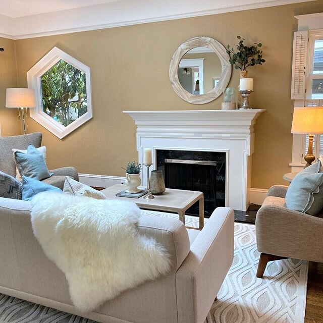
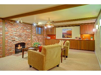
This is the family room. We tried to fit a couch but the openings would not allow, so we moved to a love seat-nope that would not work either. Two tries and $100.00 later in moving fees we just went with chairs.
In the end, what do I know. This house had 2 offers the week it went on the market. I'm just the stager with big design opinions. It must be a good house...to someone.